Token
Token is a compact representation of an object, and is typically used to show a collection of related metadata.
On this page
On this page
Overview
Tokens almost always appear in a group. A group of tokens may be read-only, or they may be used as a way to input data.
A read-only group of tokens organizes information in a way that helps users quickly scan and understand the view they're on. For example, a list of topics associated with a repository.
Tokens may be used for data input to quickly add and remove items to a list of related attributes. For example, defining a list of GitHub users who can access a private repo.
Anatomy
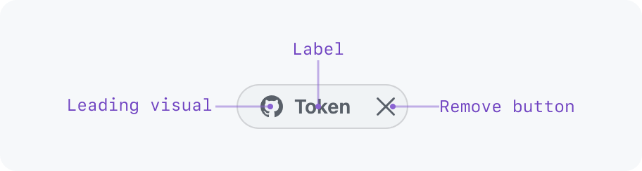
- Leading visual (optional): Provides additional context (e.g.: user avatar)
- Label (required): Concise text label
- Remove button (optional): Removes the token from an editable group of tokens
Interactivity
Tokens are almost always interactive. When a token is interactive, it will react to cursor hover and keyboard focus.
While tokens may have the same interactivity as a button or a link, a token should not be used as a replacement for a button.
If a token is a link or button and it has a remove button, keyboard focus will only go to the link/button. Keyboard users can remove a token by focusing the link/button and pressing "Backspace" or "Delete". When a screen reader is focused on a removable token, it will read the token's label and tell users to press "Backspace" or "Delete" to remove it.
Examples of interactions:
- An issue label token that links to a list of issues with that label
- A user token that shows a profile summary dialog on hover
Sizing
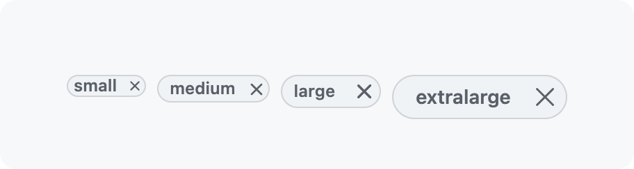
Different token sizes can be used to maintain visual harmony with the other content on the screen or to maintain a comfortable touch target for interactive tokens.
Keep visual hierarchy in mind. Large tokens should not visually compete with elements that have a higher priority.
A group of tokens should not have tokens of different sizes.
Grouping tokens
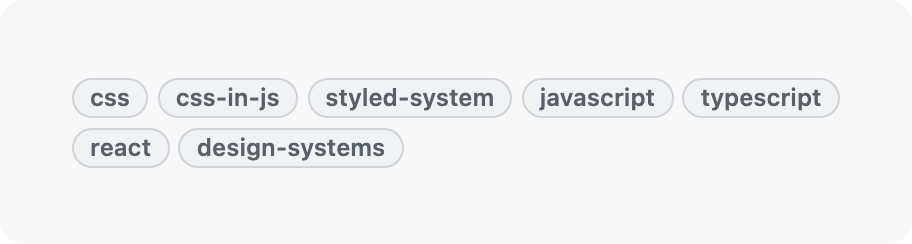
A group of tokens should flow like words in a paragraph, not a vertical list. This keeps the group compact to improve scannability.
Tokens that represent different types of data should not be grouped together.
Interactive tokens should not be grouped with non-interactive tokens.
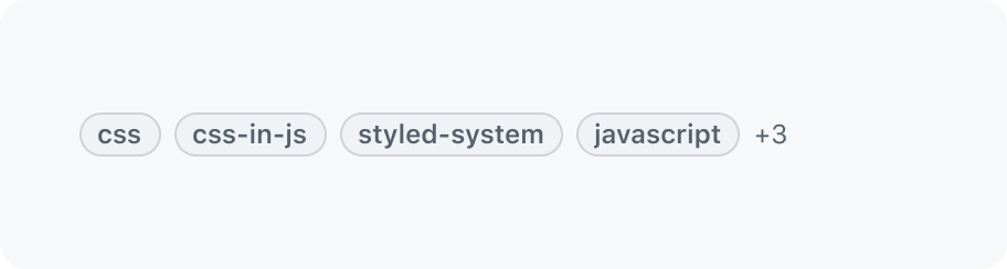
When space is limited, like in a table, some tokens in a group may be hidden. The amount hidden tokens is added in a text label, e.g. `+3`. Make sure to add an accessible label like `3 more tokens` to make this screen reader accessible.
It is important to make sure that the detail view of the list item allows users to access all tokens.
Within a text input field
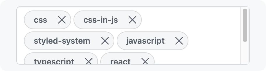
By default, tokens wrap to the next line and expand the height of the input. This allows users to see many tokens at once.
To limit how large the input can grow, a maximum height can be defined. After the input grows past that maximum height, it will scroll vertically.
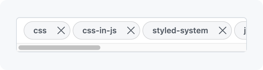
If the input is being used in a spot where the input height cannot grow, tokens can be forced to a single line that scrolls horizontally.
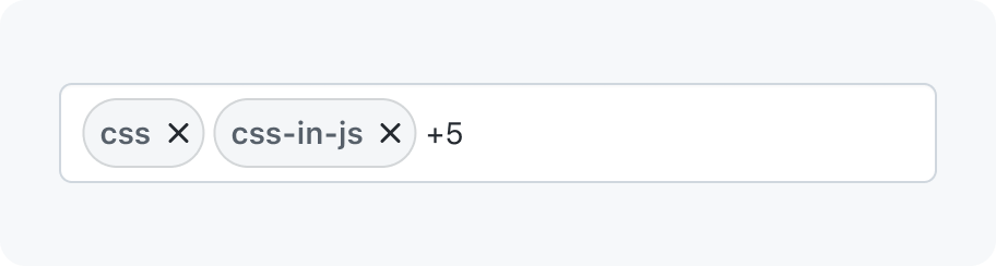
If it would be overwhelming to show all of the tokens at once, you can choose to only show a specified number of tokens until the input is focused. This functionality can be used whether the tokens wrap to multiple lines or if they're constrained to a single line.
Tokens as a way to enter information
If tokens are being used for data input, it should be obvious that the user is in an edit or creation context.
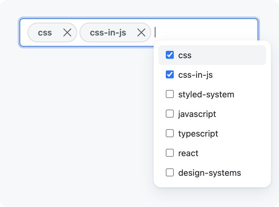
Tokens can be added or removed from a group in the way that makes the most sense for your use case. We recommend using an autocomplete component to allow users to sort through a list to pick options.
The remove button is the recommended way for removing a token from a group, but you can hide it if there is a simple alternative that makes more sense for your use case. You can also keep the remove button visible while still providing other ways to remove the button from a group.
Accessibility
To make tokens accessible to keyboard users and those who require accessible contrasts, make sure to fulfill the requirements below.
4.5:1contrast between the label (text and icon) of the token and it's background- when in focus a token must have a visible focus outline
- if a token can be removed, the keyboard focus must be moved to the previous token after deletion. If no token remains, it must focus on the input itself.
- if a close button is used, it’s name should use the token’s label to make it unique